

Uni-President Health is a U.S. commercial chain (Shenzhen) company, a self-created cosmetics chain brand of Taiwan's Uni-President Supermarket, specializing in creating a well-known cosmeceutical brand integrating health and beauty
Health is beauty, health is beauty, and it conveys the concept that the company expects everyone to be healthier and more beautiful; THE ENGLISH NAME "COSMED" IS A COMBINATION OF THE PREFIXES "COSMETICS" AND "MEDICINE", WHICH CONTAIN BOTH "HEALTH" AND "BEAUTY". In order to echo this concept and expectations, Kang Shimei chose "Woodpecker" as the protagonist of the trademark, and used the well-known title of "Forest Doctor" to bring out a fresh, healthy and reliable image of the company. The brightly coloured and colorful wings of the woodpecker are the best endorsement of "beauty". The characteristics of both health and beauty make "Woodpecker" and "Kang is Beauty" skillfully combined into a complete and complete corporate logo, conveying the spirit and vision of the enterprise, bringing consumers a bright, healthy and hearty impression, and giving full play to the communication and mutual trust between enterprises and consumers.
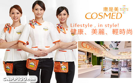
Since its establishment in 1995, Kangshimei has provided consumers with "healthy" and "beautiful" services, which are widely loved by consumers; In addition to the milestone of the number of stores, Kang Shimei is looking forward to the comprehensive upgrade of brand equity. In 2007, with the brand concept of "health, beauty and high professionalism", Kang Shimei not only provided the original service level, but also strengthened the professional license, professional and unique product structure and enhanced the professional image inside and outside the physical channel store, so as to meet the brand upgrade image of the times.
The Corporate Identity system has been greatly updated: in addition to correcting the Woodpecker trademark curve, it has highlighted its woodpecker image, and the font and arrangement ratio of the service mark name have been more carved to keep pace with the times; The standard color has also been changed to a friendly and warm orange tone, and the overall visual image is more international and professional. The furnishing space and decoration design of the store are created by well-known Japanese designers, which not only makes the consumption flow more smoothly, but also makes the comfortable and pleasant shopping space and pleasant store area delineated, so that consumers are willing to spend more time to stop and enhance the fun of shopping.